Order promo products with confidence
Elevate your company's Branded apparel
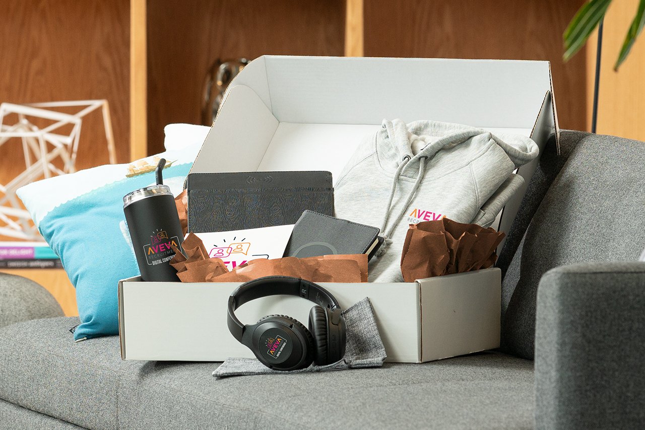
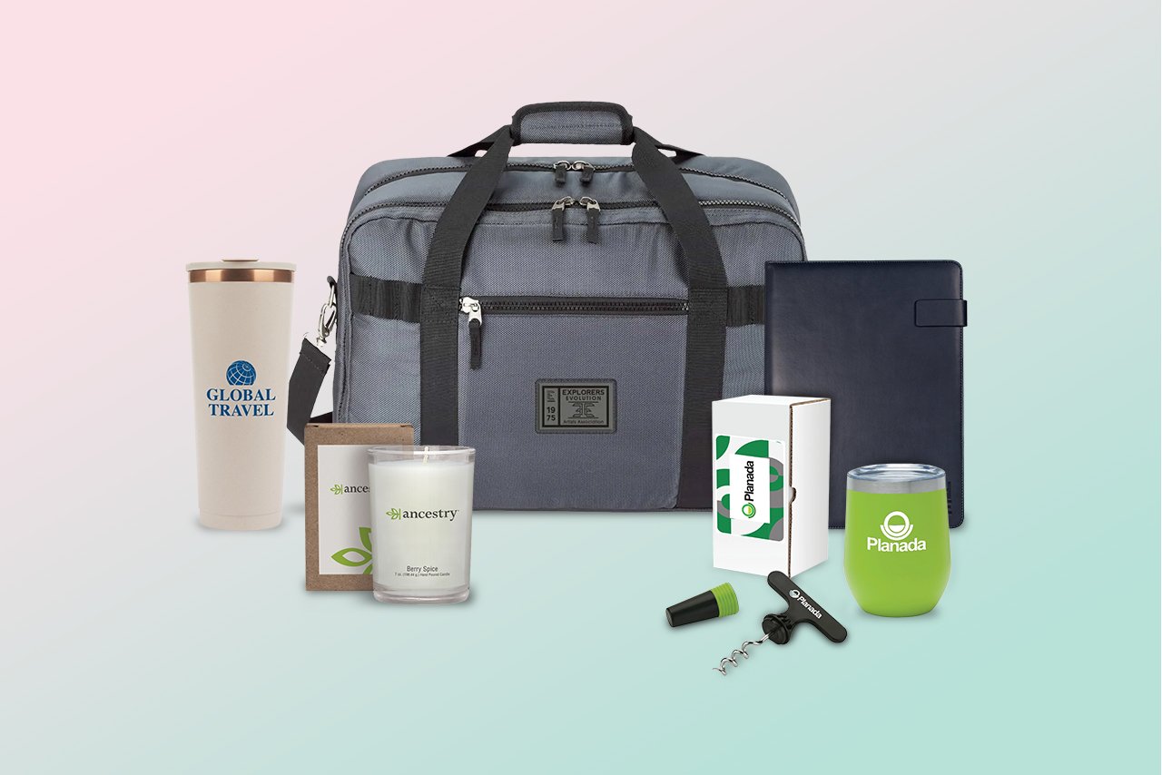
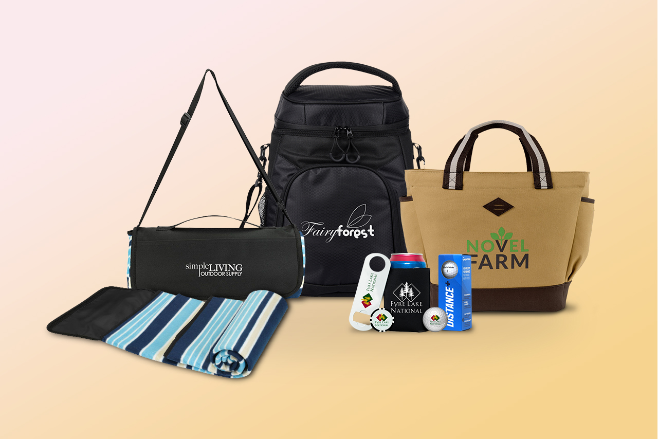
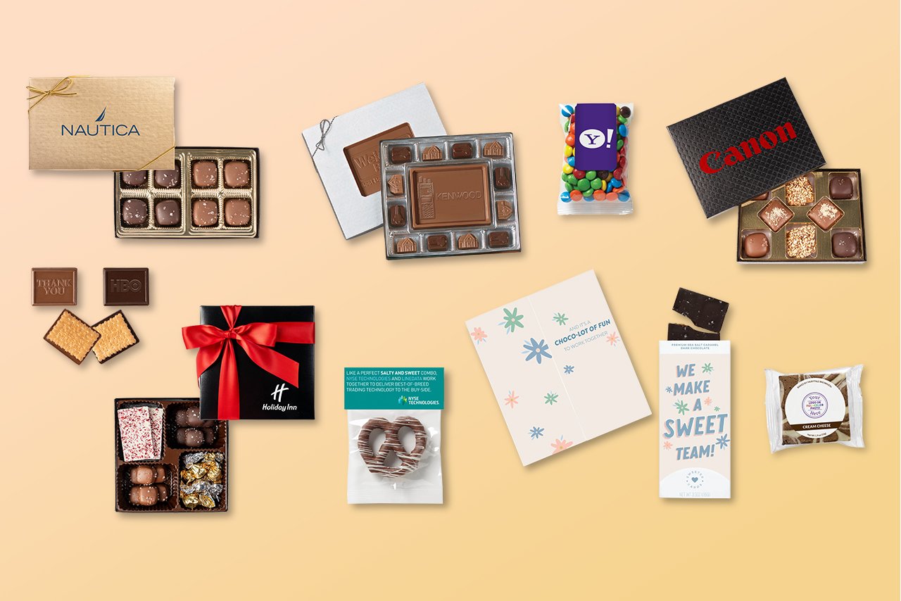
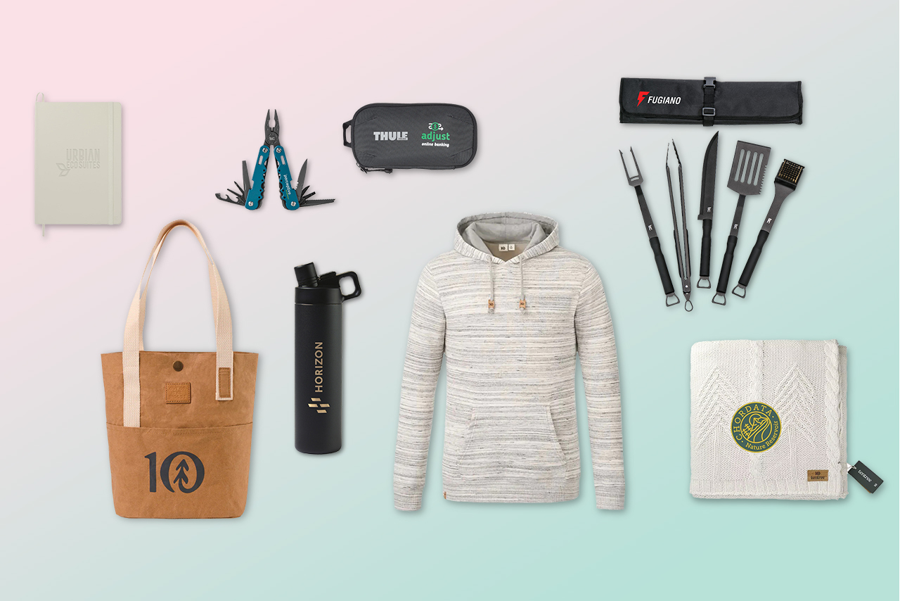
Brand name swag your recipients love
Choose sustainable eco-conscious swag
Ideas and inspiration for your next event
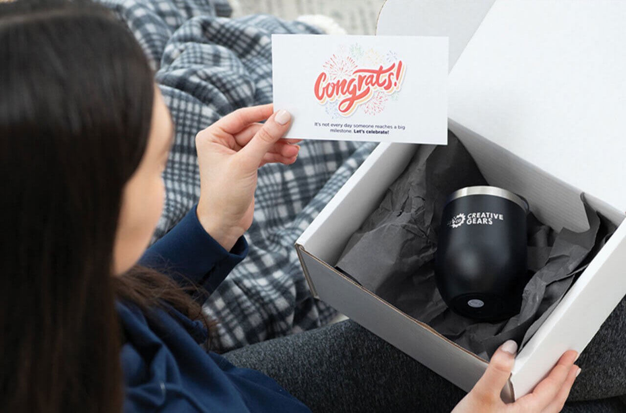
Inspire loyalty with meaningful recognition
GoDelta makes corporate gifting easy with branded business gifts and gifting automation.
Corporate gift ideas ➜
Discover a fully integrated swag store solution
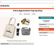
Create a custom online shopping experience
Deliver memorable brand experiences
Elevate your brand with performance-creative
Discover a fully integrated solution that automates your company swag store.
Learn More ➜
Real results, real impact.
Showcasing our creative work
Learn how GoDelta developed and launched a new brand for Cecelia Health.
Explore swag ideas & marketing insights
Find inspiration with our swag lookbooks
Free step-by-step guides made by our experts
Free, handy resources to get the job done
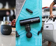
Get the Inspiration Swag Box so you can experience tranding and popular swag.
Meet GoDelta
Learn, grow & succeed at GoDelta
An integrated approach to branded merch
Need help? We will contact you today.
Our technology and partnerships pave the way for your success and growth.
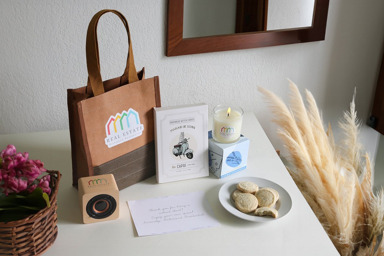
Recognize employees with thoughtful, memorable, and personalized work anniversary gifts. GoDelta can help you send the perfect branded gifts to employees.
December 13, 2024
November 7, 2024
June 5, 2024
May 28, 2024
May 17, 2024
May 14, 2024
May 6, 2024
May 2, 2024
April 26, 2024
April 23, 2024
April 15, 2024
April 2, 2024
March 13, 2024